Sole designer for Findability. I restructured navigation, market display, and page hierarchy across iOS, Android, and web, so customers can find, combine, and act on bets in one session.
+29.6%
Bet-add rate, sport pages
80s → 70s
Median time to bet placed
+3.5%
Bets per customer, YoY
Role Staff Product Designer
Team Findability (sole designer)
Platforms iOS · Android · Web
Validation A/B testing · FullStory
01
Context
Caesars Sportsbook carries thousands of live and pre-match markets across sports, leagues, and bet types. Breadth was a competitive advantage, but also a source of friction. Customers struggled to discover relevant bets, navigate market hierarchies, and place multiple selections within a single session.
The brief I set: don't add content. Make the existing inventory easier to find, combine, and act on.
02
The problem
1
Too many steps
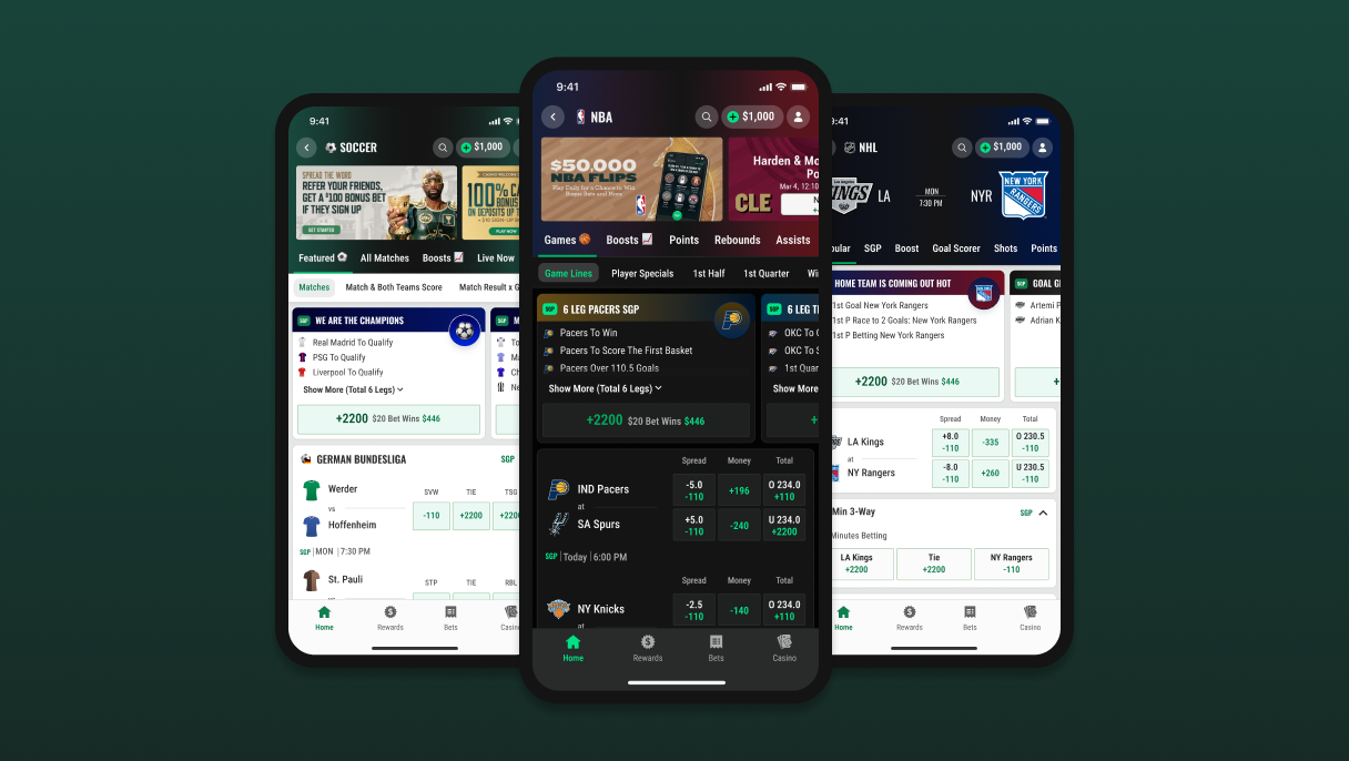
Most pages only showed basic options. Anything else meant repeated back-and-forth navigation.
2
Hard to scan
Long, unstructured lists made it difficult to quickly spot what mattered.
3
No visual guidance
Flat, uniform design made it harder to prioritise information and act confidently.
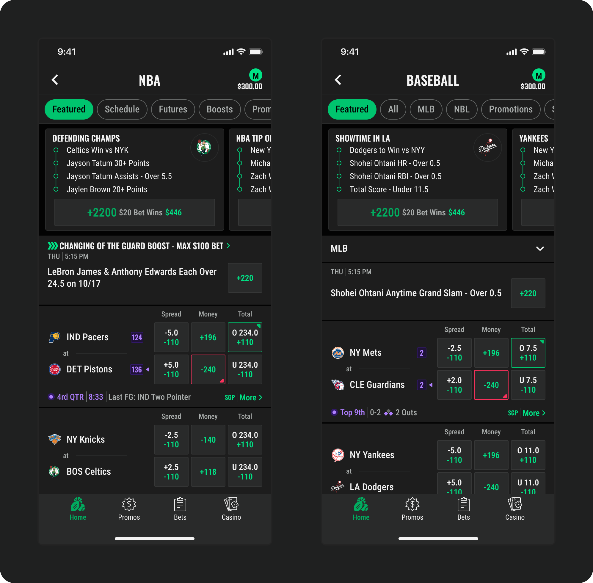
Fig. 02 · Before: competition & sport pages
03
Approach
Rather than redesigning everything, the work focused on restructuring content, improving hierarchy, and strengthening visual guidance: three workstreams, shipped incrementally behind experiments.
3.1 · Expanded page navigation
Clear primary and secondary navigation on key pages cut the need to repeatedly open individual games. Customers discover and combine bets across games without back-and-forth, and publishing teams can dynamically highlight options by demand and seasonality.
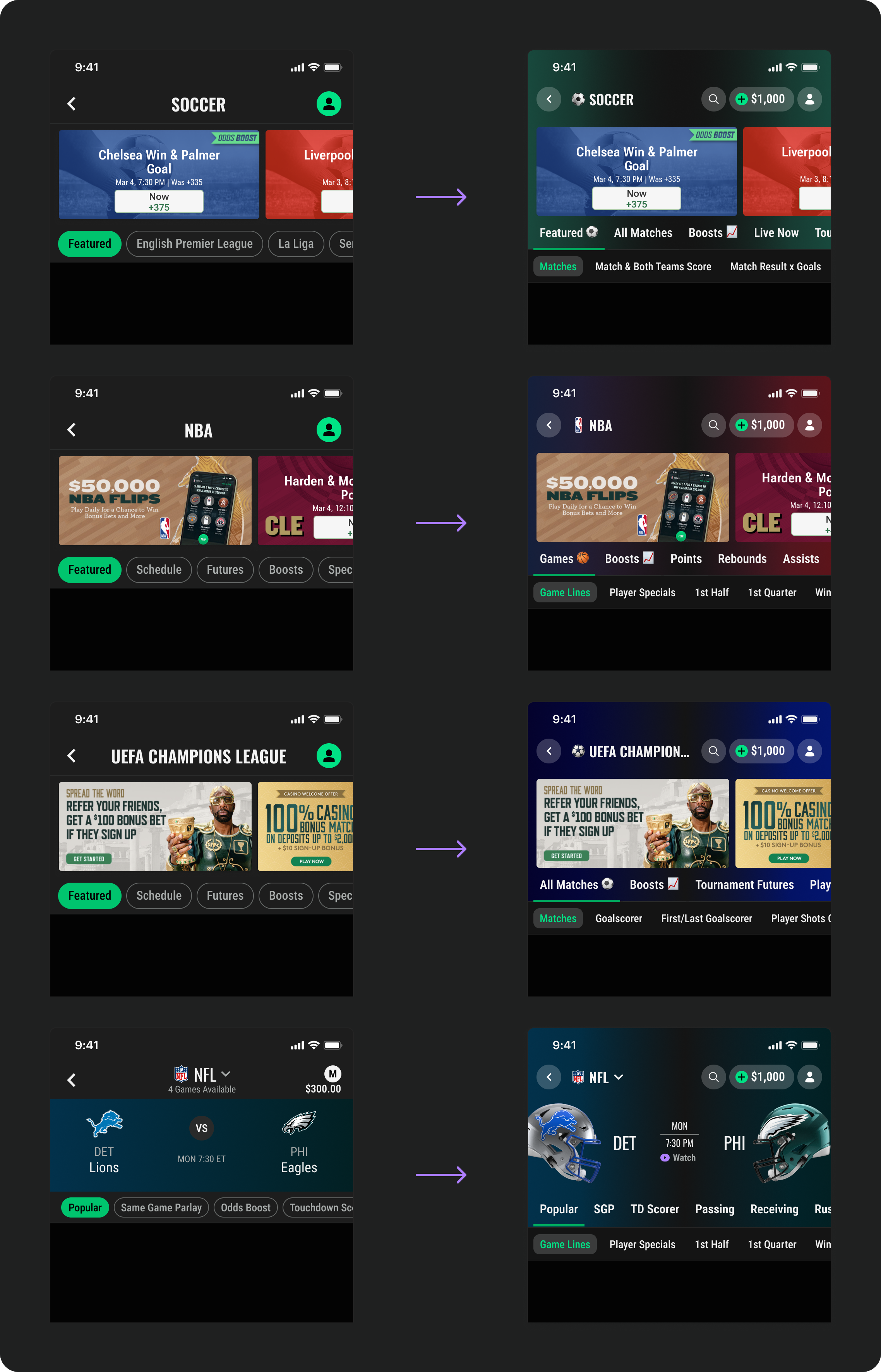
Fig. 03 · Improved market nav on sport, comp & event pages
3.2 · Rethinking market display
One layout for every bet type meant long pages and excessive scrolling. Purpose-built display patterns, each matched to a bet type, reduced vertical space, improved clarity, and gave publishing teams control over structure and prioritisation.
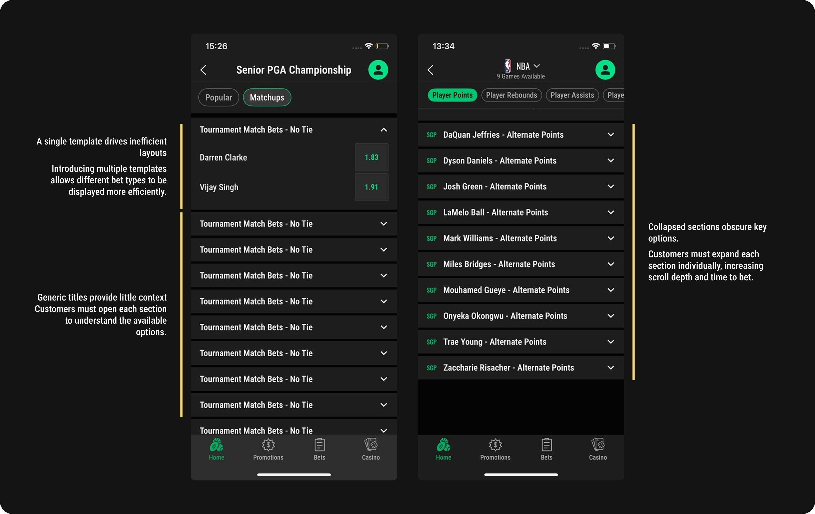
Fig. 04 · Before: one layout for every market
Single row
Compact horizontal layout for browsing many options without increasing page length.
Multi row
Structured grid surfacing multiple selections simultaneously for easier comparison.
Fig. 05 · Scrolling market templates
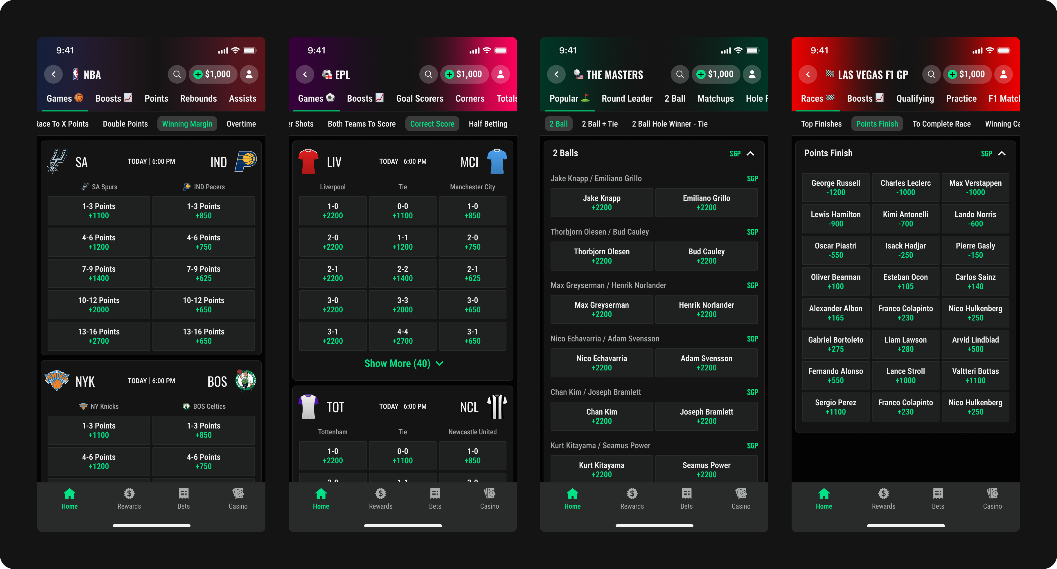
Fig. 06 · Column markets: flexibility & density
3.3 · Visual redesign & content structure
Team and league branding separates navigational content from betting options; a card-based layout groups related content into distinct, scalable sections. Hierarchy customers can feel, without reading.
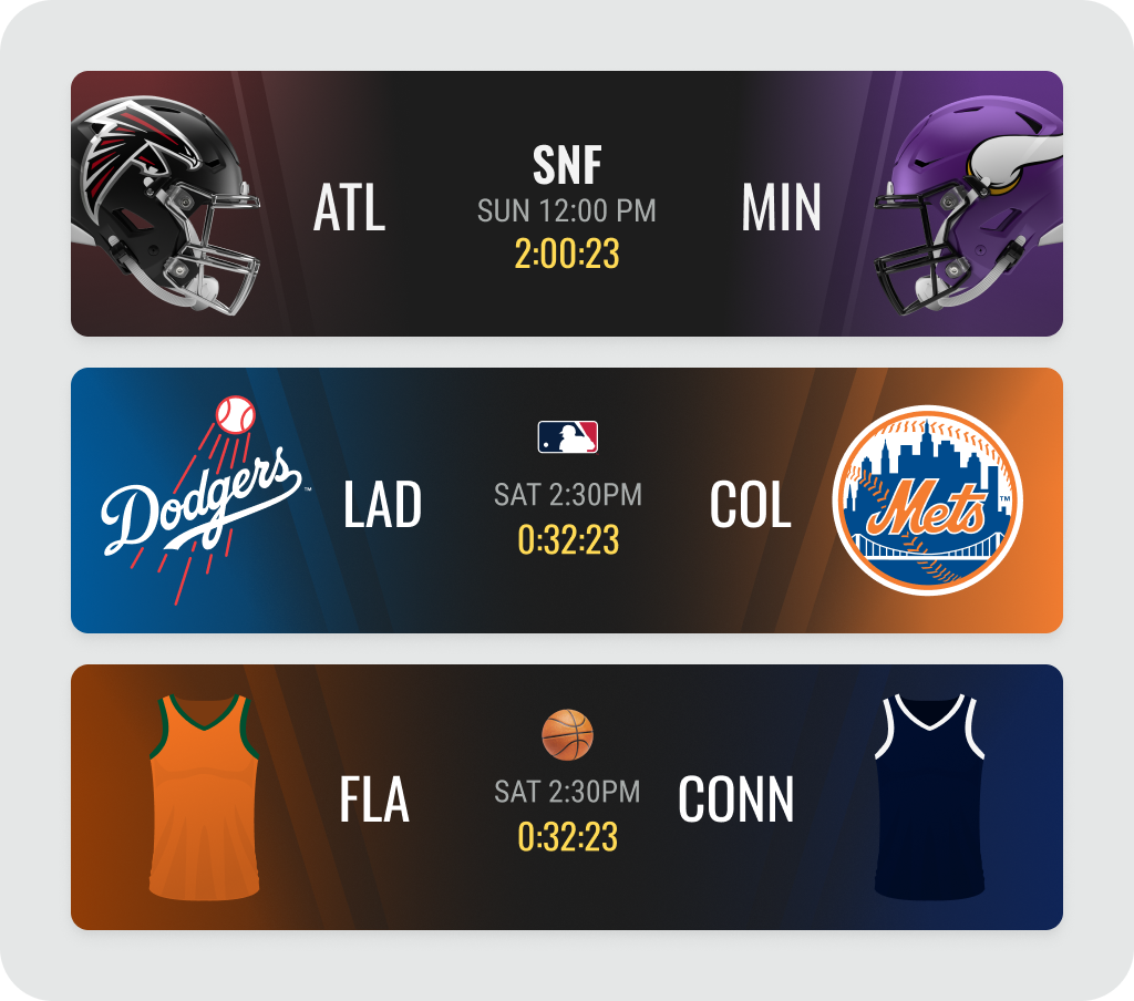
Fig. 07 · Leveraging team IP for visual interest
04
Decisions & trade-offs
A
Cap density per template, not globally
More markets per screen encourages combining bets, but punishes scanning. Purpose-built templates trade a little consistency for a lot of scannability.
B
Extend the design system, don't fork it
Discovery needed patterns CUI didn't have. Partnered with the design systems team on token extensions; the patterns were later adopted into CUI and reused by other teams.
C
Editorial freedom inside fixed hierarchy
Publishing teams highlight markets by demand and seasonality, within templates that fix page structure, so pages stay predictable while content stays fresh.
05
Outcomes
Customers added selections earlier in their journey and combined more bets per session. Structural improvements to discovery translated directly into engagement, efficiency, and sustained betting behaviour, measured 30 days after rollout.
+29.62%
Bet-add rate, sport pages
+12.05%
Bet-add rate, competition pages
80s → 70s
Median time to bet placed
+2.45 pts
Competition share of total bets
+1.55 pts
Sport share of total bets
+3.5%
Bets per customer, year on year
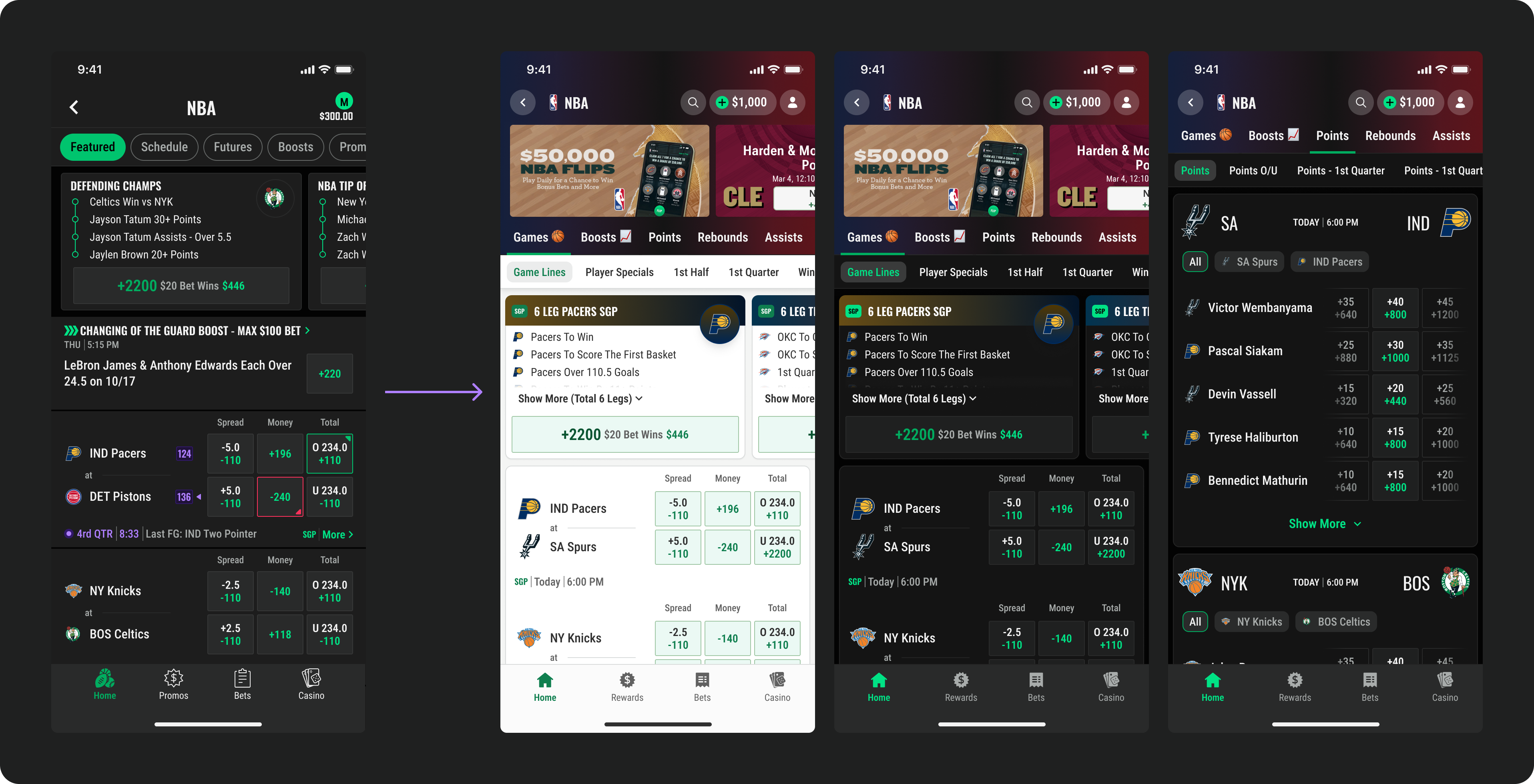
Fig. 08 · After: competition page
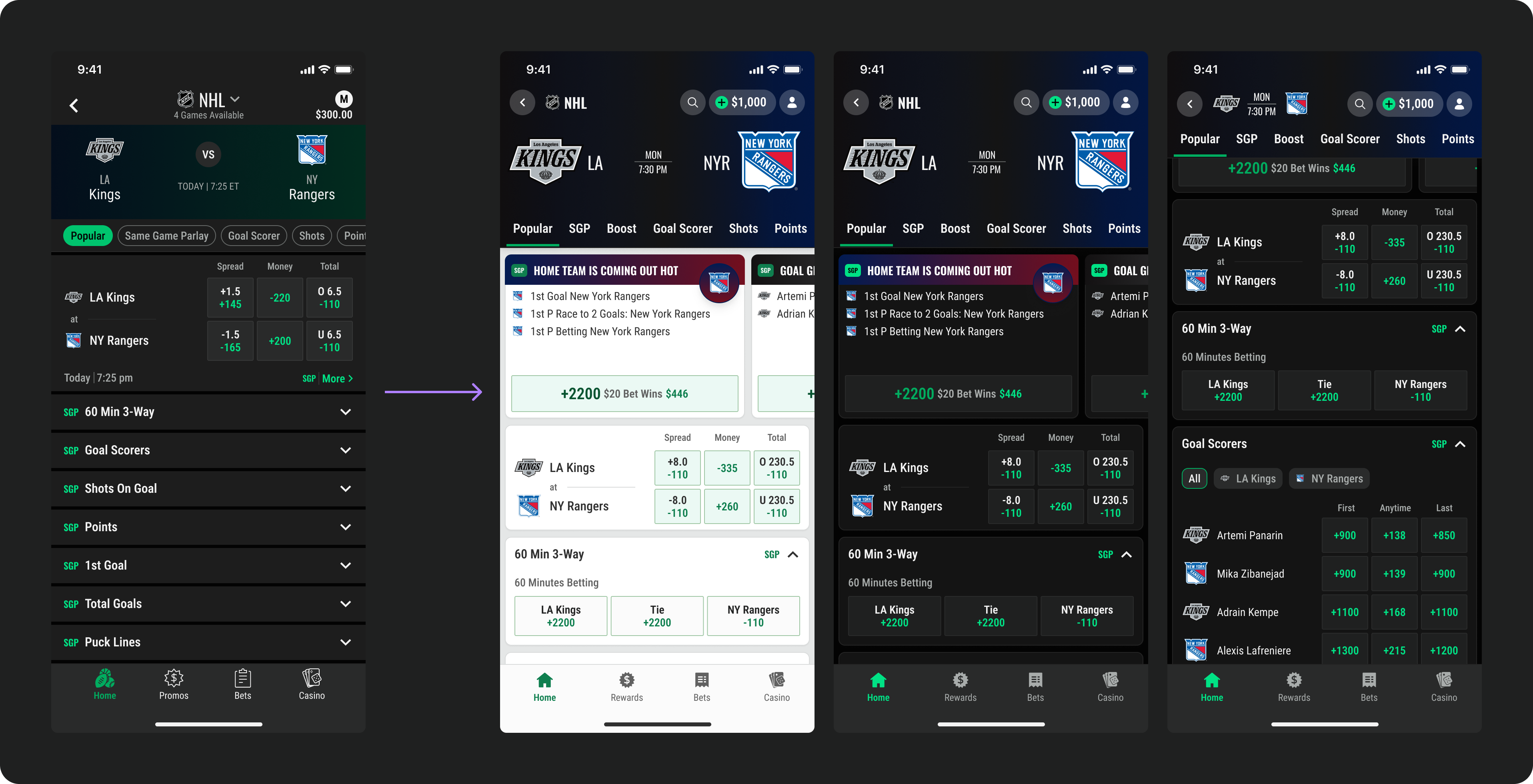
Fig. 09 · After: game page
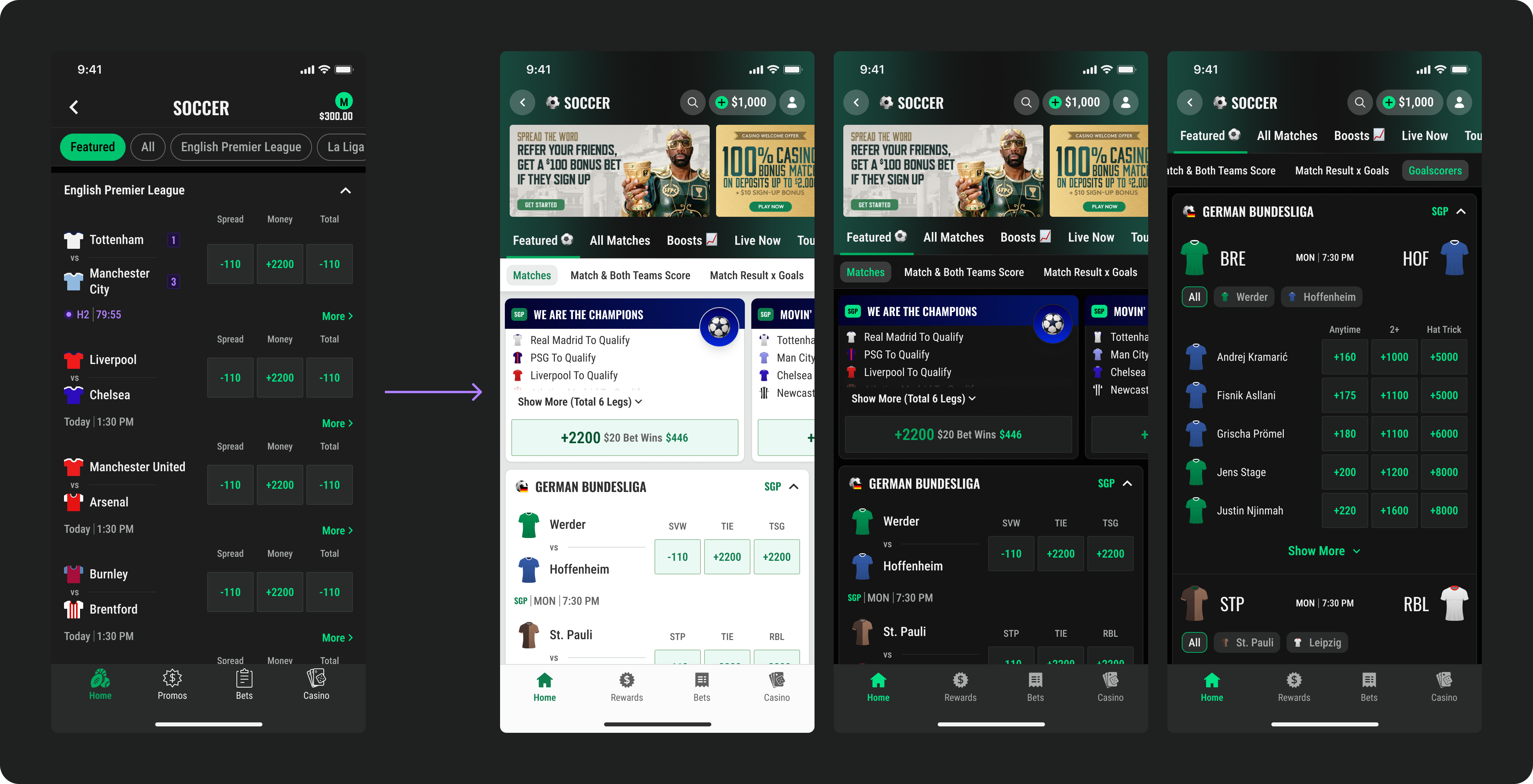
Fig. 10 · After: sport page
Up next · Side project
22 Weeks of Football Data & Claude
Side project, tracking my weekly 7-a-side game